
Prompting for a Plot
How to ask PAIX Navigator for the chart you want, and how to refine it.
The short version
Say what you want to see, on which cohort, and optionally as which chart. You don’t have to specify everything up front — the agent picks a sensible chart and grouping, and you iterate with follow-up messages to adjust it.
A good first prompt gets you a correct chart. Follow-ups make it the chart you pictured.
What makes a good prompt
The agent needs enough to write one aggregating SQL query and map its columns to a chart. Four ingredients cover almost everything:
| Ingredient | Question it answers | Example |
|---|---|---|
| Measure | What are we counting or measuring? | “number of cases”, “age at diagnosis”, “overall survival” |
| Cohort | Over which subset of the dataset? | “TCGA lung adenocarcinoma”, “CPTAC clear cell renal cell carcinoma” |
| Grouping | Split or compare by what? | “by cancer type”, “stratified by tumor stage”, “tumor vs normal” |
| Chart type (optional) | How should it look? | “as a violin plot”, “as a stacked bar chart” |
If you leave out the chart type, the agent chooses one that fits the shape of the data. If you name a type, it uses that type (as long as it’s one of the 12 supported types).
Worked example - survival
Prompt: “Plot Kaplan–Meier overall survival curves for the top 5 TCGA cancer types, and include the log-rank p-value.”
- Measure: overall survival · Cohort: top 5 TCGA cancer types · Grouping: by cancer type · Chart: survival (Kaplan–Meier)
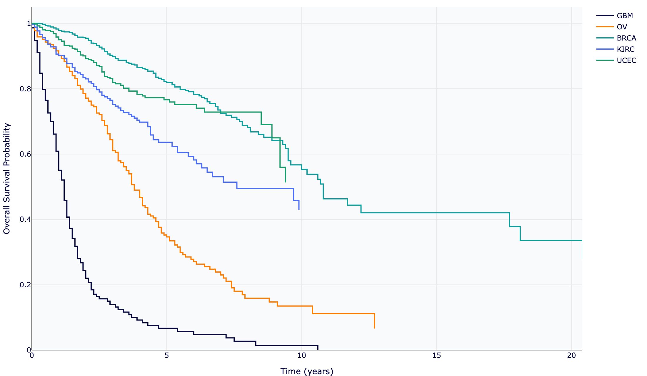
The agent recognised a time-to-event question, selected the survival chart type, stratified by cancer type, and computed censoring-aware Kaplan–Meier statistics alongside the curves.
Worked example — comparison, then reshape
Start with a distribution comparison:
Prompt: “Compare the distribution of age at diagnosis across the top 5 TCGA cancer types as a violin plot.”
Then refine in a follow-up — because each new message builds on the prior data context, you can pivot the view without restating everything:
Follow-up: “Now show the same as a box plot.” Follow-up: “Only include stage III and IV patients.” Follow-up: “Relabel the x-axis to the full cancer-type names.”
Formatting tweaks — colours, labels, titles, axis names — are best made this way, as follow-ups, rather than crammed into the first prompt.
Naming the chart type
If you have a specific chart in mind, say so. These phrasings map directly to supported types:
| You say… | You get… |
|---|---|
| “…as a bar chart” | bar |
| “…as a stacked bar chart” / “composition of…” | stacked_bar |
| “distribution of… as a histogram” | histogram |
| “…as a pie chart” / “share of…” | pie |
| “…as a box plot” | box |
| “…as a violin plot” | violin |
| “scatter of X vs Y” / “relationship between…” | scatter |
| “scatter-plot matrix of…” / “pairwise…” | splom |
| “heatmap of…” | heatmap |
| “Kaplan–Meier…” / “survival curve…” | survival |
| “radar chart comparing…” | radar |
| “parallel categories of A → B → C” | parallel_categories |
Tips
- Let it aggregate. Ask for the summary (“cases per cancer type”, “median age by stage”), not the raw dump. The agent writes GROUP BY / COUNT / percentile SQL so the result is already plot-ready.
- One comparison at a time. “Age by stage” is clean; “age by stage and gender and cancer type” may not map to a single chart — split it across follow-ups.
- Distribution charts need raw rows. Histograms, box, and violin plots draw per-observation values, so phrase them as “the distribution of …” rather than a pre-summarised statistic.
- Iterate. If the first chart isn’t quite right, correct it conversationally - the agent keeps the query context.
Always sanity-check a chart against the caption and the underlying table before trusting it.